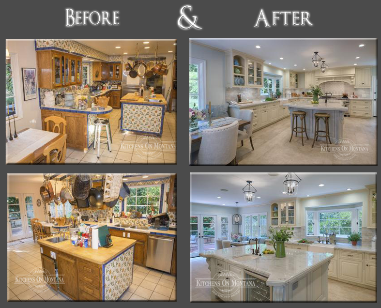

Before and after pictures invariably tell an interesting story, but for this kitchen remodel, the contrast between the old and the new is especially remarkable.Designer Lisa Steinbach Schecter of Kitchens on Montana took a tired, over-decorated country kitchen with floral tiled soffits and panels, and transformed it into a classically refined, highly functional family kitchen.”The original kitchen was congested and awkward to work in,” Schecter says. “The heavy soffits also made it feel very closed in, and a peninsula and huge pot rack were two particular eyesores.”The designer says the owners wanted a lighter, more airy kitchen along traditional lines. They also required a better flow to the overall space.
“We removed all the fixtures, including the peninsula and an arched wall around the cooking center. And we widened the doorway to the dining area and glazed a rear door. This helped to open up the space and let in more light.”Schecter also swapped the positions of the refrigerator and cooking center to improve the work triangle.”In the original kitchen, there was no landing space either side of the range,” she says. “Now there is plenty of counter space, and because the island is larger, the perimeter work areas are much closer to the island countertop and prep sink.”To enhance the classical look, Schecter created a strong sense of symmetry through the cabinet design. Cabinets feature raised panel doors with beaded insets. A soft white shade was chosen for the perimeter cabinets, while the island is a pale silvery gray.
“We teamed this with beautiful quartz stone countertops that are reminiscent of a Monet painting,” the designer says. “The island also features clipped corners and corbels that help to make it stand out as a special centerpiece.”Overhead display cabinets showcase glass and stemware, and incorporate decorative plate racks. Wherever possible, appliances are integrated into the cabinets to continue the traditional look.